
Email
hello@rowan.com
Location
Los Angeles, CA




Haven
Haven | Self-Directed Studio Concept
2026
Brand Identity
Logo Design
Brand Guidelines
Overview
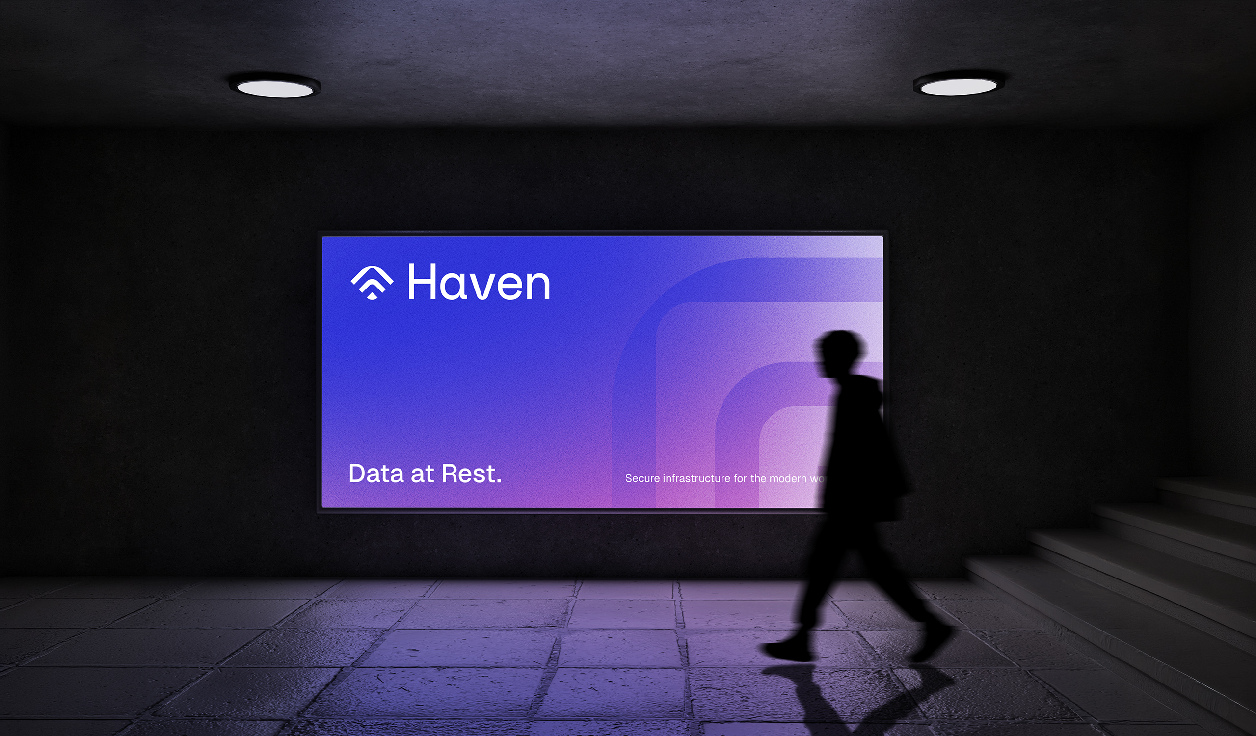
Haven is a B2B SaaS concept for a secure workspace where companies can organize, share, and protect sensitive information belonging to customers, employees, and stakeholders. Most tools in this category treat security as a technical afterthought, burying users in dashboards, alerts, and jargon instead of reassurance. Haven set out to prove that protection could feel calm and intentional instead of fear-driven.
Approach
Where competitors lead with threats and technical dominance, Haven needed to lead with trust. The brand direction centered on restraint over noise: clear structure, human-centered language, and quiet confidence, built for operations managers, HR leaders, and compliance teams who value clarity over technical depth. Every visual decision was weighed against one question: does this feel responsible, or does it feel like it's trying to impress?
Execution
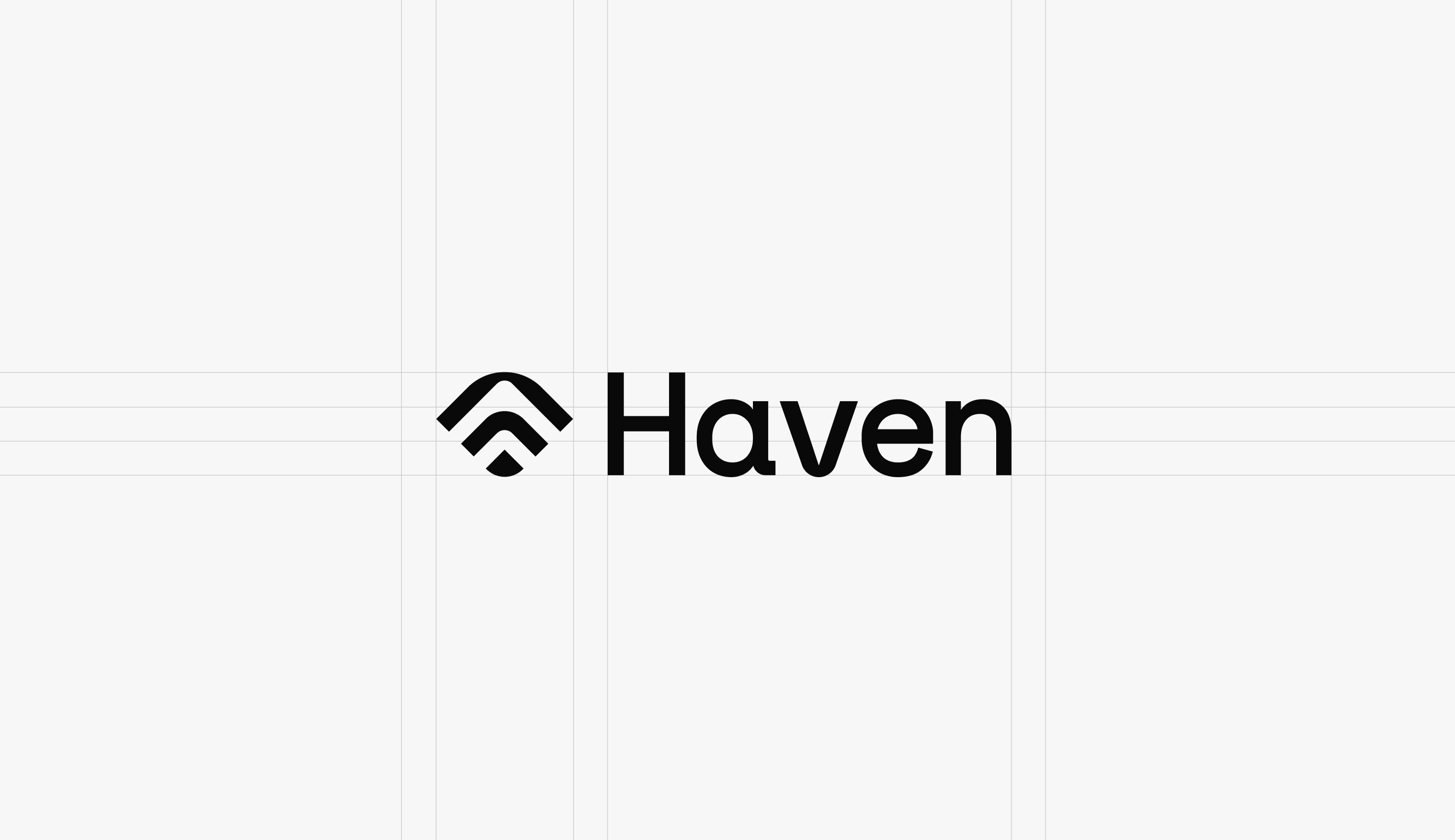
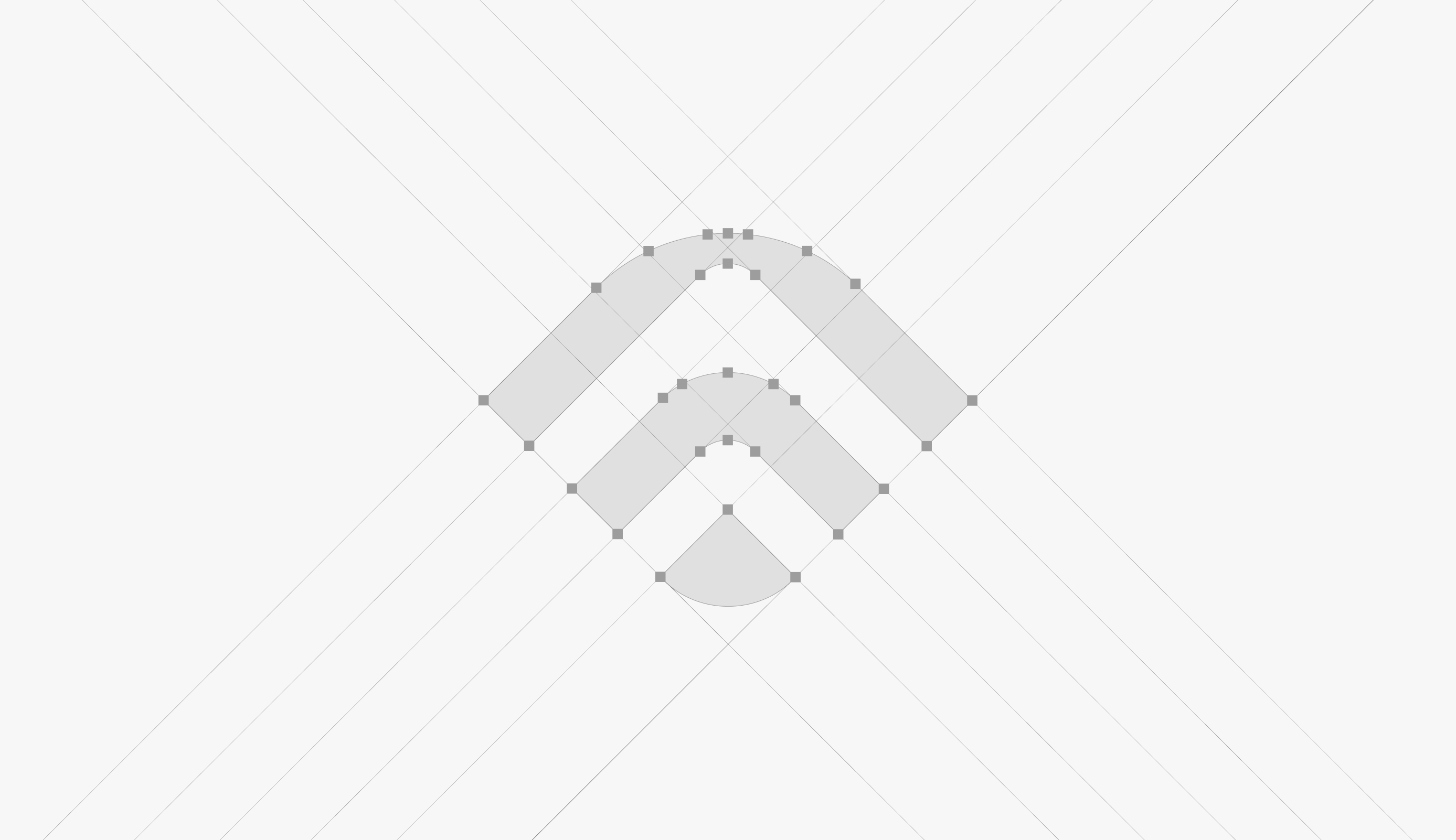
I developed Haven's full brand identity from the ground up, including the logo, wordmark, color palette, typography system, and brand guidelines. A restrained palette and quiet, confident typography stood in for the industry's usual instinct to signal strength through visual noise.
Impact
The result is a brand system that reads as steady and trustworthy rather than clinical or alarmist, proof that a security product can build confidence through calm design instead of fear-based messaging. Haven shows an ability to translate a strategic brand position into a cohesive visual system, independent of any single client's constraints.
See More


%20(1).jpg)
Subscribe to my newsletter